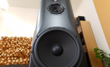
The Story of Our New Logo
In this blog, we would like to introduce our new logo to you.
This year, SoundImports is celebrating its 5th anniversary. We are proud to see how we have grown. Everything began in a small student room and over the past years we developed into The European player for HiFi DIY audio components. In these last five years, we started working together with a lot of great brands in the DIY audio market in order to supply them to our European customers at the highest possible service level.
Seeing where we are now and where we are going, we felt that the branding of our company did not represent us anymore. We are doing business as a company should in the year 2020 and we believe our branding should reflect this.

Our new, fresh looking logo exemplifies the innovative, forward thinking, and modern company we are now and the fact that we are leading on the European market for audio components. At the same time, it is designed in a way that reflects our roots and values:
- The modern look and feel of our logo reflect the way we are doing business. Customer care is the centre of our attention. We are more than a place where you can shop: Our technical support is there to assist you with your DIY-projects, and we strive to offer the best customer service on the market. If you are happy with what we do, so are we. But that does not mean we are stopping here, we’ll keep improving our service every day.
- The icon of the logo consists of two symmetrical sound waves which are turned by 180 degrees. This symmetry reflects our punctual way of doing business and that we have a modern, well-structured website with a good online findability.
- The orange in the logo reflects the Dutch national colour. Both our office and warehouse are located in the Netherlands which means that we are able to get your packages delivered throughout Europe quickly. Also, items can be returned easily, and our support team is there to answer your questions during European working hours.
- The dot at the end represents our ‘no nonsense, period’ vision. We stand for absolute transparency by showing accurate stock levels on our website and communicating clearly about lead/delivery. We do what we say, and we say what we can live up to; we stay true to our words!
We are excited about our new layout and hope you are too!


 Home audio
  Audio components
  Crossover components
  Test & measurement
  DIY kits
  Accessories
  New products
  Speakers
 Amplifiers
 DAC converters
 DSP modules
 Turntables
 Streamers
 Woofers
 Tweeters
 Exciters
 Bass shakers
 Plate amplifiers
 Amplifier modules
 Single board computers
 Assembled crossovers
 Printed Circuit Boards (PCB)
 Capacitors
 Resistors
 Coils
Coils Circuit Breakers
 Crossover tools
 Screw terminals
 Acoustic measurements
 Electric measurements
 Sound level meters
 DIY amplifier kits
 DIY component packs
 DIY speaker kit
 DIY subwoofer kits
 DIY bluetooth speaker
 DIY electronics kits
 Binding posts
 Cabinet Hardware
 Cables
 Connectors
 Speaker cabinets
 Electromechanics
 Power supplies
 Speaker repair
 Workshop & tools
 Amplifier accessories
 Stands & mounts
 Gift voucher
 Books
Books New products





 Speakers
 Amplifiers
 DAC converters
 DSP modules
 Turntables
 Streamers
 Woofers
 Tweeters
 Exciters
 Bass shakers
 Plate amplifiers
 Amplifier modules
 Single board computers
 Assembled crossovers
 Printed Circuit Boards (PCB)
 Capacitors
 Resistors
 Coils
Coils Circuit Breakers
 Crossover tools
 Screw terminals
 Acoustic measurements
 Electric measurements
 Sound level meters
 DIY amplifier kits
 DIY component packs
 DIY speaker kit
 DIY subwoofer kits
 DIY bluetooth speaker
 DIY electronics kits
 Binding posts
 Cabinet Hardware
 Cables
 Connectors
 Speaker cabinets
 Electromechanics
 Power supplies
 Speaker repair
 Workshop & tools
 Amplifier accessories
 Stands & mounts
 Gift voucher
 Books
Books New products
